
Making Madrid's transport network easier to start using
A research and service design review of how tourists and commuters discover, buy and use public transport in Madrid — online and on the street.
The brief
A quick UX review of the Consorcio Regional de Transportes de Madrid website — the authority behind the city’s metro, buses and commuter trains — and its possibilities for improvement. Not a single redesign that solves everything, but a clear reading of who uses the network, what they need, and where the experience breaks.
Three objectives: understand the different types of users and map their needs, shape a concept that addresses them, and prepare prototypes for validation.
What was broken
A heuristic evaluation of the website surfaced the problems any first-time rider meets within minutes:
A service, not a website
Riders do not meet the transport authority only on its website. They meet it through the city, their jobs, their errands and their appointments — and through ticket machines, apps, maps and friends’ advice. Mapping those relations shifted the question from “how do we fix the site” to “where does the whole service fail people”.
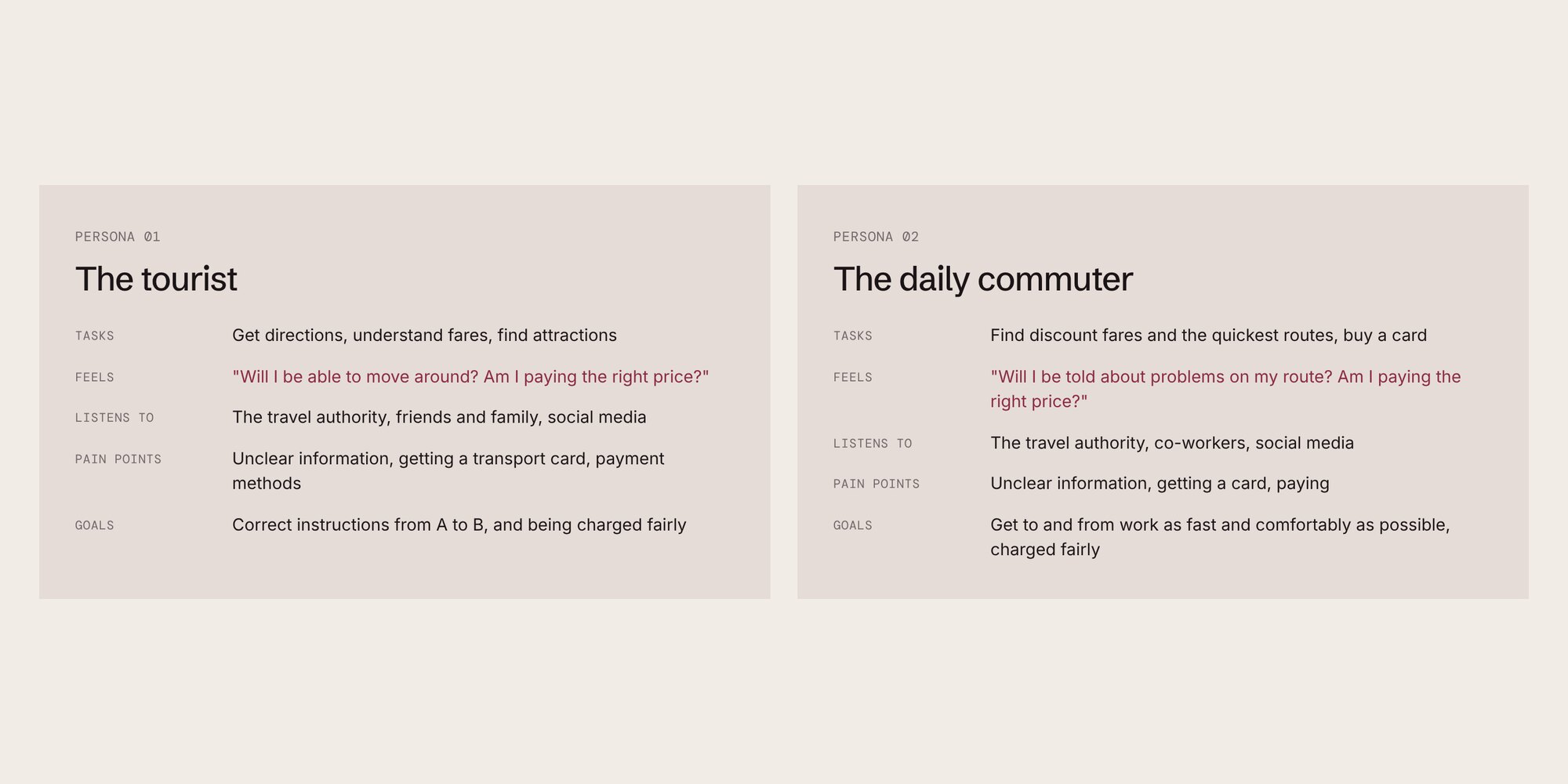
Research pointed to three drivers behind choosing public transport — efficiency, convenience and conscience — and to two very different riders.
The tourist
- Tasks
- Get directions, understand fares, find attractions
- Feels
- "Will I be able to move around? Am I paying the right price?"
- Listens to
- The travel authority, friends and family, social media
- Pain points
- Unclear information, getting a transport card, payment methods
- Goals
- Correct instructions from A to B, and being charged fairly
The daily commuter
- Tasks
- Find discount fares and the quickest routes, buy a card
- Feels
- "Will I be told about problems on my route? Am I paying the right price?"
- Listens to
- The travel authority, co-workers, social media
- Pain points
- Unclear information, getting a card, paying
- Goals
- Get to and from work as fast and comfortably as possible, charged fairly
The end-to-end journey
I mapped the journey across four stages, with every touchpoint the service owns — and the ones it doesn’t. The “decision and action” stage, where people buy and set up their card, was where the service lost them.
What good looks like
A benchmark of transport authorities known for their digital service — Hong Kong’s among them — showed the patterns Madrid was missing:
- A trip planner present throughout the site, not buried in one page.
- Fares and tickets structured to be scanned, with suggestions of the right ticket for the trip.
- Personalisation for quick access to live status, saved journeys and places.
- Mobile payment as a first-class option.
These became the design principles for the concept and the basis of the user scenarios to prototype and test next.